Case Study
Alternate Universes
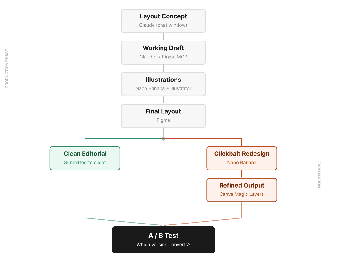
Every design process is full of directions you didn't take. Usually those directions just disappear. This workflow does something different — it materializes the alternatives. So you can test them against each other.
Case Study
Every design process is full of directions you didn't take. Usually those directions just disappear. This workflow does something different — it materializes the alternatives. So you can test them against each other.
The content problem was already solved. A copy doc laid out a five-step journey through the digestive system — mouth to gut bacteria — for a Smarter Reviews landing page infographic. Clear, structured, ready to visualize.
The design question was harder: how many genuinely different visual answers can a single brief produce? That question, it turned out, was worth answering literally.
Instead of opening Figma first, I opened Claude.
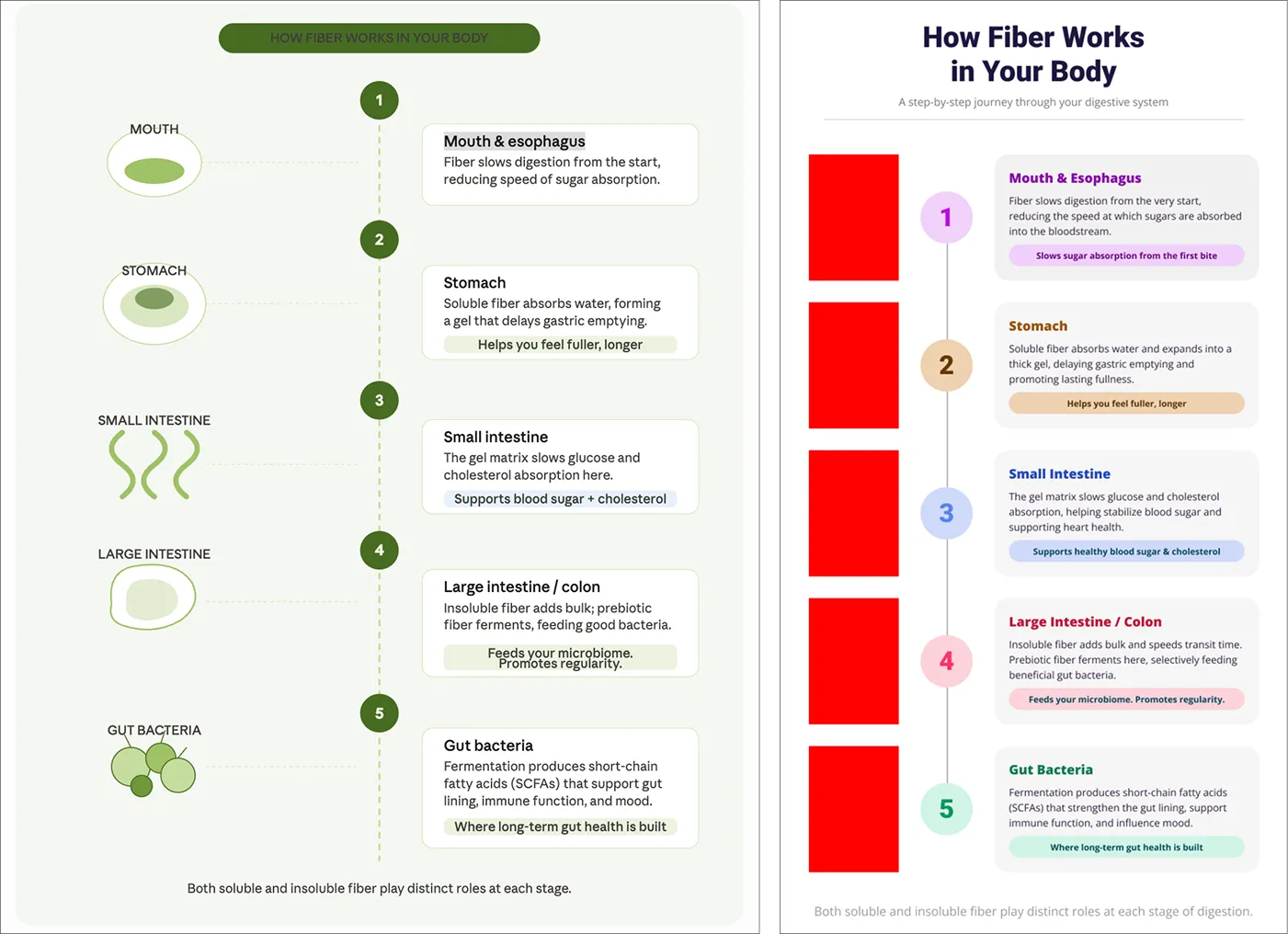
That’s a small change to the sequence that changes what “concept” means. Claude produced a layout directly in the chat window — a vertical flow diagram with numbered steps, anatomy icons on one side and text cards on the other. Not a finished design, but a fully formed structural position I could agree or disagree with. Treating it as a proposal rather than a starting point meant I arrived at Figma with a considered direction, not a blank canvas.
That draft was raw material, not a deliverable. I worked through the typography, spacing, color palette, and hierarchy — pushing it toward something that felt considered and mine.
For the illustrations, the copy called for anatomical icons — a mouth, stomach, small intestine, large intestine, and gut bacteria — clean enough not to overwhelm the information. I used Claude to generate image prompts targeted to that style, then fed them into Nano Banana (running on Gemini 3.1 Flash), iterating until the set felt visually unified.
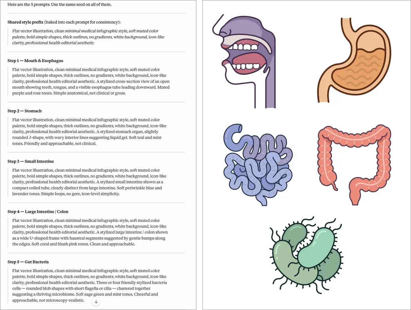
Nano Banana’s output was raster. Automated vectorization through a Weavy node was an option, but after weighing the credit cost against the control I’d give up, I ran the illustrations through Illustrator’s Image Trace — faster, free, and cleaner for this kind of stylized linework. That’s not a workaround; it’s a decision. The choice of where to automate and where to use a traditional tool is part of the art direction. I placed the vectors in Figma, finalized the layout, and submitted for stakeholder review.
Here’s where the workflow gets interesting.
Every design decision carries an implicit counterpart — the version that would exist if you’d optimized for something different. In a traditional process, those alternatives live only as mental discards. You make a choice, you move on, the other direction stops existing.
I wanted to see what this infographic looked like if I’d optimized for entirely different values. So I shared the finished design with Nano Banana and asked it to redesign it in a maximalist, high-stimulation aesthetic — everything the editorial version deliberately wasn’t.
What came back was maximalist in every direction: saturated colors, glowing photorealistic organs, bold all-caps headlines, an energy that borders on overwhelming. Structurally similar, but completely aesthetically different from what I’d designed. Completely coherent on its own terms.
The flat output wasn’t editable, so I brought it into Canva and used the Magic Layers feature to extract editable layers from it. That gave me enough control to make real refinements — not starting from scratch, but not just accepting the raw output either. The result was something I couldn’t have designed intentionally, but could meaningfully improve once it existed.
This is where I’d usually write “the clean version is what goes to the client.” But we’re going to run both. The alternatives don’t have to disappear — they can compete.
The clean editorial version says: we trust you with information. The maximalist version says: we need to earn your attention before you’ll take it. Same five facts about how fiber moves through your body. Same structure. Different implicit contracts with the reader.
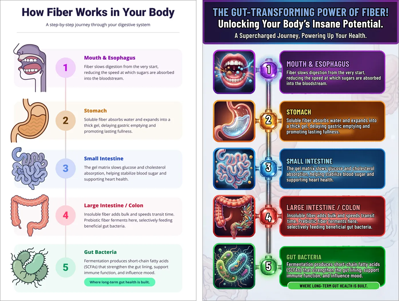
The only way to know which contract the audience actually responds to is to test them against each other. That’s what A/B testing is for — and this workflow made both versions deployable fast enough to make that worth doing.
Stay tuned to find out which one won.
The human work here was in the decisions: which layout concept to keep, which illustration style to pursue, when Illustrator beats an automated node, what to fix once the alternative existed. Art direction, not automation.
But the workflow added something a traditional process doesn’t offer: a second finished direction. Not a sketch, not a mood board — a deployable alternative, refined to the point where it can stand next to the original and compete.
That’s the thing worth carrying forward. When you use AI for exploration, you sometimes end up with production output you didn’t know you were making.